


FINTECH
MOBILE
END-TO-END UX
Currenzy for Currency Exchange
The first app that lets users check exchange rates, transfer money internationally, and compare providers all in one place.
TIMELINE
Feb – Apr 2026
ROLE
Sole Product Designer
SKILLS
Figma, Product Design
LONG STORY SHORT
I designed Currenzy from 0 to 1.
From initial research through final prototype, I led every aspect of the design process: defining the problem, validating with users, iterating through wireframes, and delivering a hi-fi prototype ready for handoff. My main accomplishments included:
01 Research
Conducted competitive analysis and secondary research on finance forums to surface the pain points in money transfer ecosystem.
02 Design
Owned wireframes, information architecture, and a full hi-fi prototype across 3 core flows.
03 Validation
Ran usability tests and iterated based on findings.
💭
How might we help people who send money internationally make confident and informed decisions, without switching between apps or doing the math themselves?
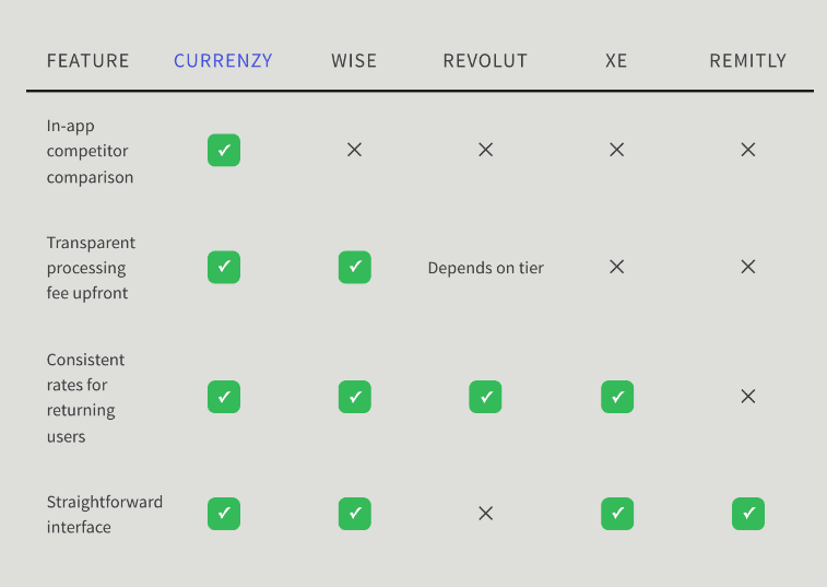
COMPETITIVE ANALYSIS
To create a product from the ground up, I evaluated what gaps existed in the market
I looked into four direct competitors in the cross-border money transfer space and identified the lack of in-app competitor comparison function.
FEATURE
CURRENZY
WISE
REVOLUT
XE
REMITLY
In-app competitor
comparison
✓
✕
✕
✕
✕
Transparent processing
fee upfront
✓
✓
Depends on tier
✕
✕
Consistent rates for returning users
✓
✓
✓
✓
✕
Straightforward interface
✓
✓
✕
✓
✓
Apps such as Wise and Remitly show exchange fees upfront and transparently, but users have to switch between apps to compare rates.
Interface on certain apps such as Revolut is overwhelming.
RESEARCH & UNDERSTANDING THE USERS
I did secondary research on finance forums
Due to time constraint, I browsed through finance forums to identity recurring user pain points, and three main pain points emerged from the research:
Unclear rates erode trust
Users describe paying $50 wire fees and losing another $300 to undisclosed markups.
Hidden fees feel like distrust
81% of Americans believed that a hidden fee included in a currency exchange transfer is a junk fee.
Complex flows drive drop-off
It takes 6 screens to complete a basic wire transfer in Revolut, one of our direct competitors.
DESIGN PROCESS
From sketches to hi-fi prototype.
Based on the usability feedback, I iterated on the wireframes and mock ups .


Check Exchange Rates
4 out of 5 participants said they’re not sure whether the old iteration allows them to convert from USD TO EUR and vice versa, so I replaced the static converter with “You Send / They receive” dropdowns and swap toggle.


Transfer Money
All participants would like to see dynamic, contextual cost breakdowns before committing to financial transactions, and one participant said, “I’d like to see the total cost before continuing.” As a result, I surfaced a real-time cost breakdown before users enter personal details.


Updated Exchange Rate Screen
Currency input consolidated from a two-step to a single row
Visual identity moved from generic fintech-blue to a navy & soft pink system


Updated Confirmation Screen
Progress indicator went from a linear bar to numbered, labeled steps, and replaced “Verify” with “Verify ID”
Cost summary moved from an undifferentiated block to a hierarchically structured panel, with the total emphasized
OPPORTUNITIES
I started the design by defining features for the MVP
I started the design by focusing on three features to build based on clarity and fairness.
Exchange Rates Check
Verify the rate before committing
Money Transfer
See processing fee visible before commitment
Provider Comparison
Side-by-side comparison of other providers in-app,
at the point of decision.
FINAL DESIGNS
Three flows. One seamless experience.
The final prototype covers the end-to-end journey — from checking a live rate, to comparing providers, to completing a transfer. Each screen is designed to reduce cognitive load and build trust.

FLOW 01
Live Exchange Rates
Users can check real-time exchange rates for any currency pair as soon
as they open the app. Popular rates are surfaced at a glance.
FLOW 02
Send Money
The send flow walks users step-by-step through a transfer: enter amount → input bank info → verify identity → confirmation. A clear summary screen ensures no surprises before the final tap.


FLOW 03
Compare Providers
Before committing to a transfer, users can see a ranked list of providers side-by-side, sorted by total cost and processing time. The "best" option is highlighted, and users can deep-dive into each provider's details.
RESULTS
What the testing showed.
I ran 5 unmoderated usability tests with the hi-fi prototype.
100%
5 out of 5 participants reacted positively to the Compare Providers screen once discovered
4 out of 5
participants completed the full transfer flow without error
After viewing the hi-fi prototype, a peer reviewer noted: “It looks clean and professional. I’d trust it with my money.”
Estimated Business impact
Significant potential when launched.
Y1 installs
150K
US iOS launch
Transactors
4.5K
10% of MAU
Transfers
18K
4/yr per user
Monthly users
45K
30% of installs
Y1 revenue
$36K
$2.00 × 18K
For reference, Wise (now an $11B public company) generated roughly $40K in their first year of operation at a similar take rate.
Currenzy's projection sits in line with what category-defining money transfer apps actually achieve in year one. The model is built to compound through trust over years, not through aggressive year-one monetization.
LEARNINGS & REFLECTION
What I took away.
🔍
Financial trust is built through micro-decisions.
“Verify” → “Verify ID” and surfacing the fee breakdown before personal details changed how safe users felt.
🔄
A single tap can make or break comprehension.
Adding an info icon next to terms like “routing number” provided users with an immediate explanation without disrupting the flow.
⚖️
The most valuable feature means nothing if users can’t find it.
The Compare screen was loved by 100% of participants once discovered, but 4 out of 5 never navigated there unprompted, which taught me that discoverability is a design problem, not a user problem.
FINTECH
MOBILE
END-TO-END UX
Currenzy for Currency Exchange
The first app that lets users check exchange rates, transfer money internationally, and compare providers all in one place.
TIMELINE
Feb – Apr 2026
ROLE
Sole Product Designer
SKILLS
Figma, Product Design
LONG STORY SHORT
I designed Currenzy from 0 to 1.
From initial research through final prototype, I led every aspect of the design process: defining the problem, validating with users, iterating through wireframes, and delivering a hi-fi prototype ready for handoff. My main accomplishments included:
01 Research
Conducted competitive analysis and secondary research on finance forums to surface the pain points in money transfer ecosystem.
02 Design
Owned wireframes, information architecture, and a full hi-fi prototype across 3 core flows.
03 Validation
Ran usability tests and iterated based on findings.
💭
How might we help people who send money internationally make confident and informed decisions, without switching between apps or doing the math themselves?
COMPETITIVE ANALYSIS
To create a product from the ground up, I evaluated what gaps existed in the market
I looked into four direct competitors in the cross-border money transfer space and identified the lack of in-app competitor comparison function.
Apps such as Wise and Remitly show exchange fees upfront and transparently, but users have to switch between apps to compare rates.
Interface on certain apps such as Revolut is overwhelming.
RESEARCH & UNDERSTANDING THE USERS
I did secondary research on finance forums
Due to time constraint, I browsed through finance forums to identity recurring user pain points, and three main pain points emerged from the research:
Unclear rates erode trust
Users describe paying $50 wire fees and losing another $300 to undisclosed markups.
Hidden fees feel like distrust
81% of Americans believed that a hidden fee included in a currency exchange transfer is a junk fee.
Complex flows drive drop-off
It takes 6 screens to complete a basic wire transfer in Revolut, one of our direct competitors.
DESIGN PROCESS
From sketches to
hi-fi prototype.
Based on the usability feedback, I iterated on the wireframes and mock ups .
Check Exchange Rates
4 out of 5 participants said they’re not sure whether the old iteration allows them to convert from USD TO EUR and vice versa, so I replaced the static converter with “You Send / They receive” dropdowns and swap toggle.
Transfer Money
All participants would like to see dynamic, contextual cost breakdowns before committing to financial transactions, and one participant said, “I’d like to see the total cost before continuing.” As a result, I surfaced a real-time cost breakdown before users enter personal details.
Updated Exchange Rate Screen
Currency input consolidated from a two-step to a single row
Visual identity moved from generic fintech-blue to a navy & soft pink system
Updated Confirmation Screen
Progress indicator went from a linear bar to numbered, labeled steps, and replaced “Verify” with “Verify ID”
Cost summary moved from an undifferentiated block to a hierarchically structured panel, with the total emphasized
OPPORTUNITIES
I started the design by defining features for the MVP
I started the design by focusing on three features to build based on clarity and fairness.
Exchange Rates Check
Verify the rate before committing
Money Transfer
See processing fee visible before commitment
Provider Comparison
Side-by-side comparison of other providers in-app,
at the point of decision.
FINAL DESIGNS
Three flows. One seamless experience.
The final prototype covers the end-to-end journey — from checking a live rate, to comparing providers, to completing a transfer. Each screen is designed to reduce cognitive load and build trust.
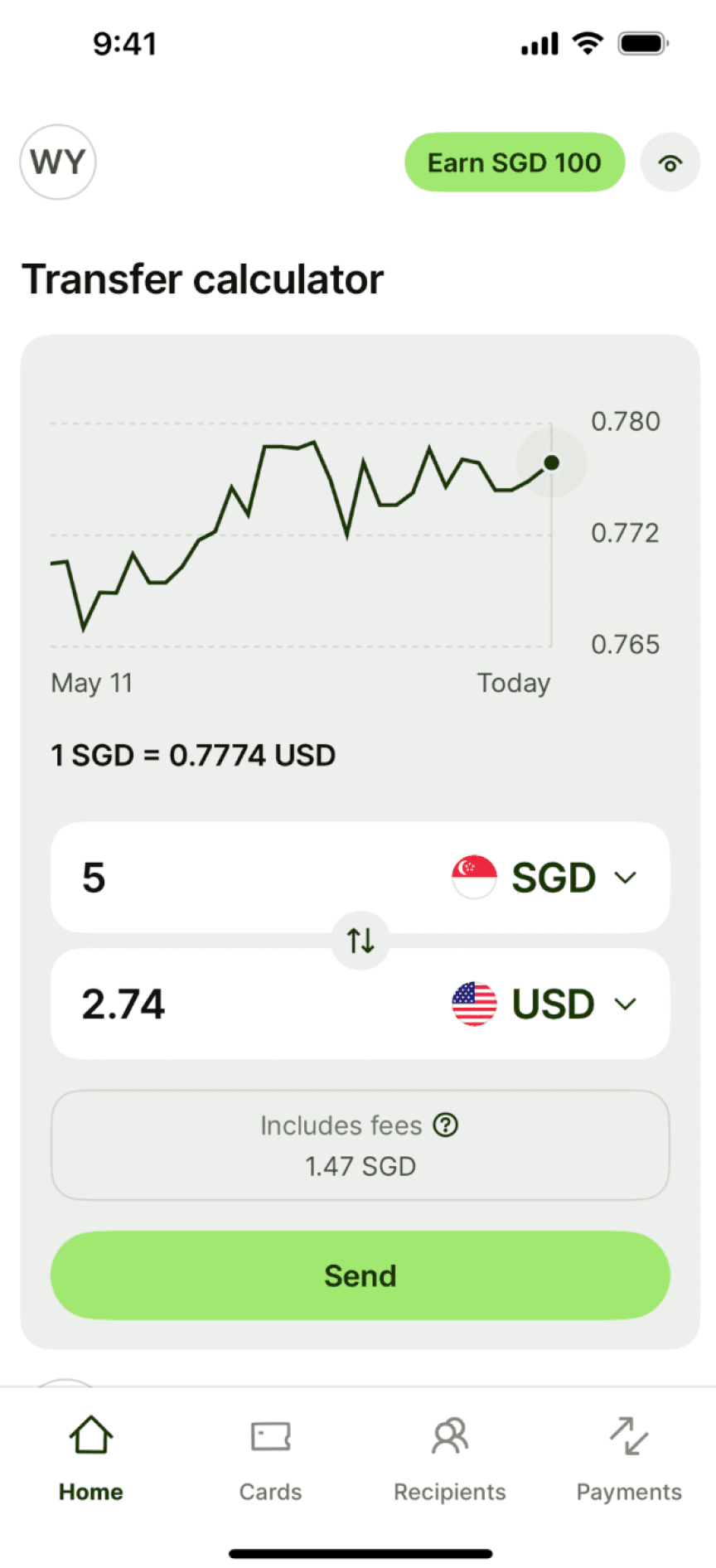
FLOW 01
Live Exchange Rates
Users can check real-time exchange rates for any currency pair as soon
as they open the app. Popular rates are surfaced at a glance.
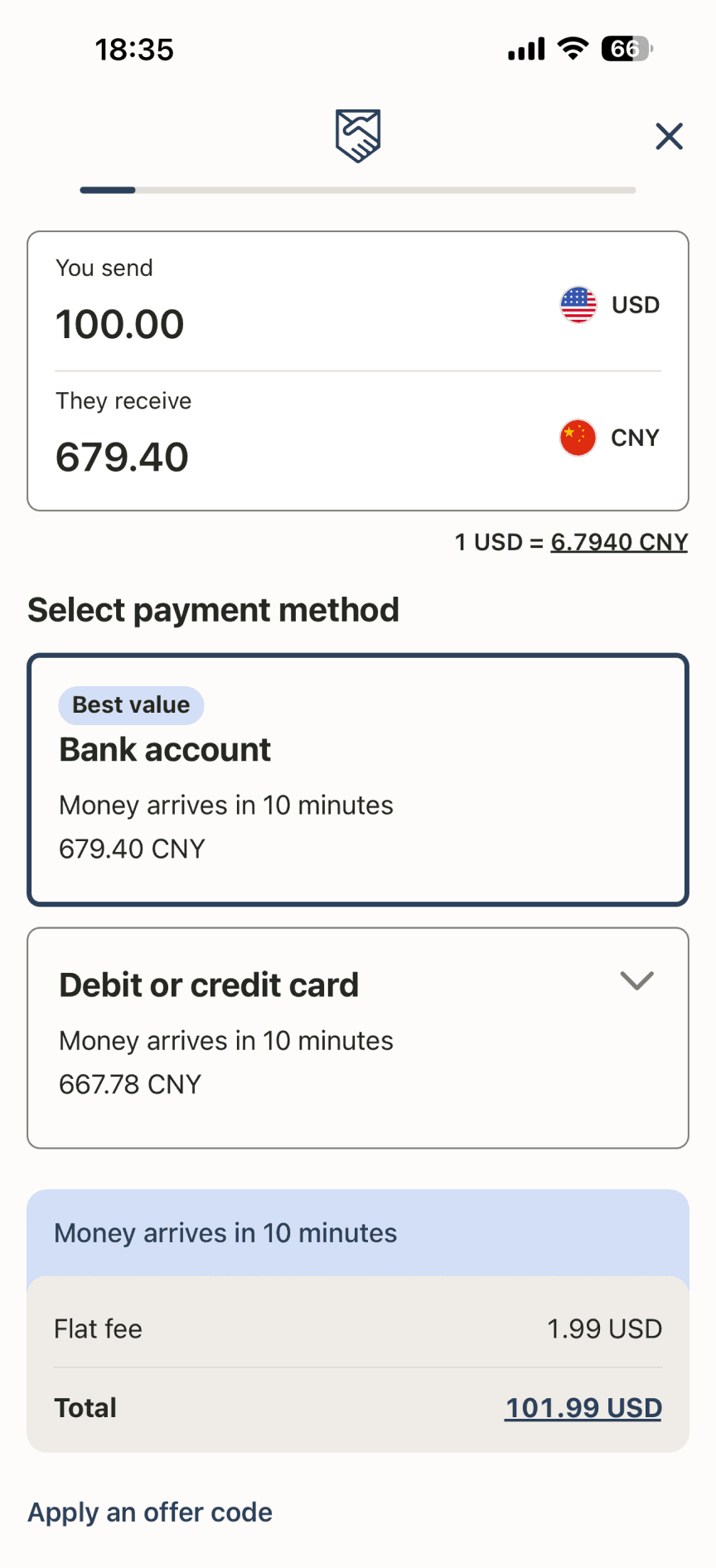
FLOW 02
Send Money
The send flow walks users step-by-step through a transfer: enter amount → input bank info → verify identity → confirmation. A clear summary screen ensures no surprises before the final tap.
FLOW 03
Compare Providers
Before committing to a transfer, users can see a ranked list of providers side-by-side, sorted by total cost and processing time. The "best" option is highlighted, and users can deep-dive into each provider's details.
RESULTS
What the testing showed.
I ran 5 unmoderated usability tests with the hi-fi prototype.
100%
5 out of 5 participants reacted positively to the Compare Providers screen once discovered
4 out of 5
participants completed the full transfer flow without error
After viewing the hi-fi prototype, a peer reviewer noted: “It looks clean and professional. I’d trust it with my money.”
Estimated Business impact
Significant potential when launched.
Y1 installs
150K
US iOS launch
Transactors
4.5K
10% of MAU
Transfers
18K
4/yr per user
Monthly users
45K
30% of installs
Y1 revenue
$36K
$2.00 × 18K
For reference, Wise (now an $11B public company) generated roughly $40K in their first year of operation at a similar take rate.
Currenzy's projection sits in line with what category-defining money transfer apps actually achieve in year one. The model is built to compound through trust over years, not through aggressive year-one monetization.
LEARNINGS & REFLECTION
What I took away.
🔍
Financial trust is built through micro-decisions.
“Verify” → “Verify ID” and surfacing the fee breakdown before personal details changed how safe users felt.
🔄
A single tap can make or break comprehension.
Adding an info icon next to terms like “routing number” provided users with an immediate explanation without disrupting the flow.
⚖️
The most valuable feature means nothing if users can’t find it.
The Compare screen was loved by 100% of participants once discovered, but 4 out of 5 never navigated there unprompted, which taught me that discoverability is a design problem, not a user problem.
Matthew Liang | Product Designer
FINTECH
MOBILE
END-TO-END UX
Currenzy for Currency Exchange
The first app that lets users check exchange rates, transfer money internationally, and compare providers all in one place.
TIMELINE
Feb – Apr 2026
ROLE
Sole Product Designer
SKILLS
Figma, Product Design
LONG STORY SHORT
I designed Currenzy from 0 to 1.
From initial research through final prototype, I led every aspect of the design process: defining the problem, validating with users, iterating through wireframes, and delivering a hi-fi prototype ready for handoff. My main accomplishments included:
01 Research
Conducted competitive analysis and secondary research on finance forums to surface the pain points in money transfer ecosystem.
02 Design
Owned wireframes, information architecture, and a full hi-fi prototype across 3 core flows.
03 Validation
Ran usability tests and iterated based on findings.
💭
How might we help people who send money internationally make confident and informed decisions, without switching between apps or doing the math themselves?
COMPETITIVE ANALYSIS
To create a product from the ground up, I evaluated what gaps existed in the market
I looked into four direct competitors in the cross-border money transfer space and identified the lack of in-app competitor comparison function.
FEATURE
CURRENZY
WISE
REVOLUT
XE
REMITLY
In-app competitor
comparison
✓
✕
✕
✕
✕
Transparent processing
fee upfront
✓
✓
Depends on tier
✕
✕
Consistent rates for returning users
✓
✓
✓
✓
✕
Straightforward interface
✓
✓
✕
✓
✓
Apps such as Wise and Remitly show exchange fees upfront and transparently, but users have to switch between apps to compare rates.
Interface on certain apps such as Revolut is overwhelming.
RESEARCH & UNDERSTANDING THE USERS
I did secondary research on finance forums
Due to time constraint, I browsed through finance forums to identity recurring user pain points, and three main pain points emerged from the research:
Unclear rates erode trust
Users describe paying $50 wire fees and losing another $300 to undisclosed markups.
Hidden fees feel like distrust
81% of Americans believed that a hidden fee included in a currency exchange transfer is a junk fee.
Complex flows drive drop-off
It takes 6 screens to complete a basic wire transfer in Revolut, one of our direct competitors.
OPPORTUNITIES
I started the design by defining features for the MVP
I started the design by focusing on three features to build based on clarity and fairness.
Exchange Rates Check
Verify the rate before committing
Money Transfer
See processing fee visible before commitment
Provider Comparison
Side-by-side comparison of other providers in-app,
at the point of decision.
DESIGN PROCESS
From sketches to hi-fi prototype.
Based on the usability feedback, I iterated on the wireframes and mock ups .
Check Exchange Rates
4 out of 5 participants said they’re not sure whether the old iteration allows them to convert from USD TO EUR and vice versa, so I replaced the static converter with “You Send / They receive” dropdowns and swap toggle.
Transfer Money
All participants would like to see dynamic, contextual cost breakdowns before committing to financial transactions, and one participant said, “I’d like to see the total cost before continuing.” As a result, I surfaced a real-time cost breakdown before users enter personal details.
Updated Exchange Rate Screen
Currency input consolidated from a two-step to a single row
Visual identity moved from generic fintech-blue to a navy & soft pink system
Updated Confirmation Screen
Progress indicator went from a linear bar to numbered, labeled steps, and replaced “Verify” with “Verify ID”
Cost summary moved from an undifferentiated block to a hierarchically structured panel, with the total emphasized
FINAL DESIGNS
Three flows. One seamless experience.
The final prototype covers the end-to-end journey — from checking a live rate, to comparing providers, to completing a transfer. Each screen is designed to reduce cognitive load and build trust.
FLOW 01
Live Exchange Rates
Users can check real-time exchange rates for any currency pair as soon
as they open the app. Popular rates are surfaced at a glance.
FLOW 02
Send Money
The send flow walks users step-by-step through a transfer: enter amount → input bank info → verify identity → confirmation. A clear summary screen ensures no surprises before the final tap.
FLOW 03
Compare Providers
Before committing to a transfer, users can see a ranked list of providers side-by-side, sorted by total cost and processing time. The "best" option is highlighted, and users can deep-dive into each provider's details.
RESULTS
What the testing showed.
I ran 5 unmoderated usability tests with the hi-fi prototype.
100%
5 out of 5 participants reacted positively to the Compare Providers screen once discovered
4 out of 5
participants completed the full transfer flow without error
After viewing the hi-fi prototype, a peer reviewer noted: “It looks clean and professional. I’d trust it with my money.”
Estimated Business impact
Significant potential when launched.
Y1 installs
150K
US iOS launch
Monthly users
45K
30% of installs
Transactors
4.5K
10% of MAU
Transfers
18K
4/yr per user
Y1 revenue
$36K
$2.00 × 18K
For reference, Wise (now an $11B public company) generated roughly $40K in their first year of operation at a similar take rate.
Currenzy's projection sits in line with what category-defining money transfer apps actually achieve in year one. The model is built to compound through trust over years, not through aggressive year-one monetization.
LEARNINGS & REFLECTION
What I took away.
🔍
Financial trust is built through micro-decisions.
“Verify” → “Verify ID” and surfacing the fee breakdown before personal details changed how safe users felt.
🔄
A single tap can make or break comprehension.
Adding an info icon next to terms like “routing number” provided users with an immediate explanation without disrupting the flow.
⚖️
The most valuable feature means nothing if users can’t find it.
The Compare screen was loved by 100% of participants once discovered, but 4 out of 5 never navigated there unprompted, which taught me that discoverability is a design problem, not a user problem.